CASE STUDY
StubHub Rebrand
From competitive analysis and ideation through design, documentation and roll out, I led internal creative design direction with our agency partners at Duncan Channon on StubHub's first major rebrand in 10 years.
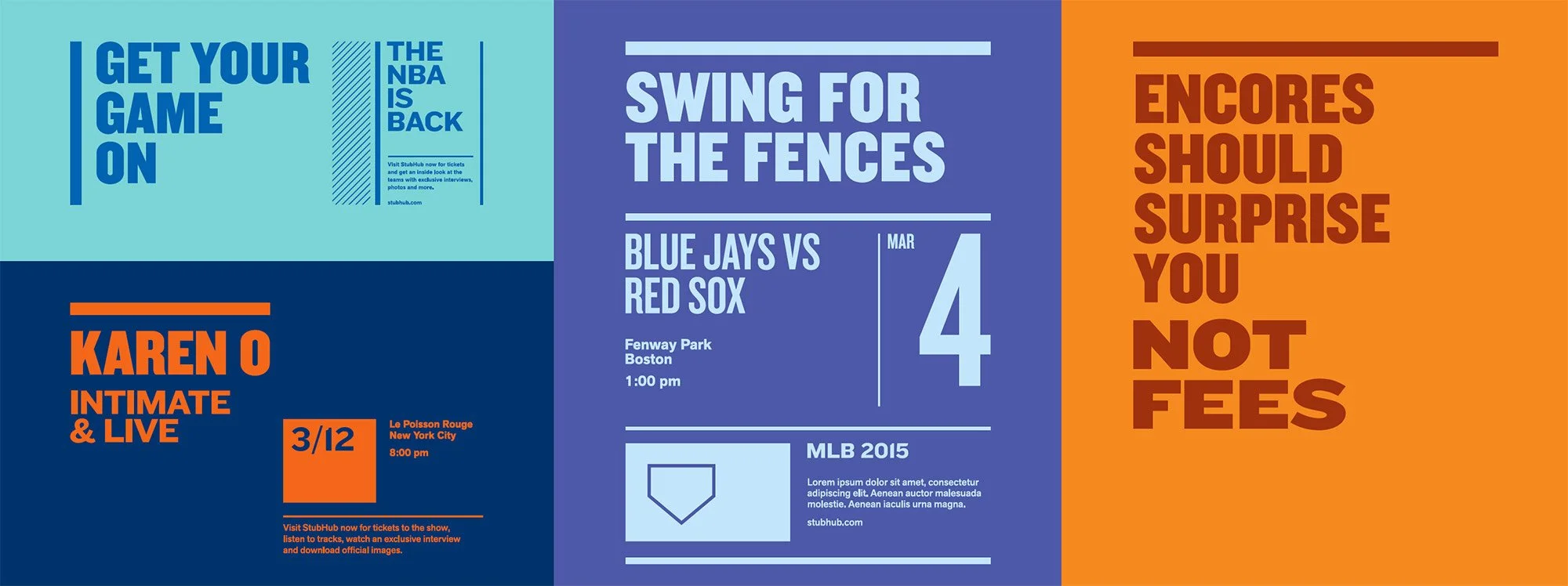
This rebrand focused on evolving the perception of StubHub as a sports-focused secondary ticketing marketplace to an event discovery destination to "help fans find fun" via our personalized, mobile-friendly, and fan-focused product. This project included a logo redesign, brand voice guidelines, new color pallet, typographic guidelines, imagery/photography guidelines, iconography/illustration/info-graphic guidelines, product and program identity development, and co-branding guidelines.
Problem & Objectives
After 10 years, the existing StubHub brand design system, initially developed for a sports focused secondary ticket marketplace was well past the end of its useful lifespan and visually outdated.
Relying heavily on generic stock photography, leveraging only two primary colors, a single generic typeface and restrictive typographic rules the system had become a hinderance to growth.
As StubHub expanded its footprint into new event genres (music, theater, comedy) primary ticketing, event discovery, it had its eyes set on becoming the destination fans of all walks of life come to find fun.
It was time for a fresh new look that appealed to these new consumers while not alienating it’s existing user base.
We set out to update, modernize and unify our brand while creating a scalable framework for granular, comprehensive brand guidelines.
Process & Strategy
After outlining our problems/objectives we began our research and discovery phase consisting of competitive landscape and historical analysis, user interviews, as well as in person focus groups across 3 of our primary markets.
During the exploration and ideation phase we created three distinct visual approaches and brought those to life with mood boards and mock layouts gathering user, stakeholder, and executive feedback.
During the refine and extend phase, we synthesized elements of the three approaches, incorporated feedback, and pressure tested the new system across a broad array of channels and mediums.
Moodboards and early layout exploration.
“Sharp, organized, clean & clear meets fun, lively & dynamic.”
Execution
Working hand in hand with our agency partners at Duncan Channon we held bi weekly workshops and check ins. Our North Star as we worked to bring the visual elements of the brand to life were our attributes “Inspiring, Savvy, Reliable, & Fun” and our new mission statement: “The source fans rely on to discover, access, and share live entertainment experiences worldwide.”
StubHub is your “go-to.” The source you rely on to handle the stuff you need handled. To know what you want and deliver it. Consistently. StubHub inspires you, informs you and introduces you to a broader world of live events.
Expanded color pallet
Graphic elements and typography
Mock layout typographic exploration
Editorial layout exploration
Having previously relied on heavily treated stock imagery, a core pillar of the new brand was leveraging real artist and team imagery. To achieve this end we hired an experienced photo editor with deep industry connections who assisted us in securing usage rights to the these images and building out a comprehensive digital asset management system.
This project included a full logo redesign, brand voice guidelines, new color pallet, typographic guidelines, imagery/photography guidelines, iconography/illustration/info-graphic guidelines, product and program identity development, co-branding guidelines, and more.
Due to StubHub’s extensive Out of Home (OOH) footprint in partner music venues and sports areas (MLB, MLS, etc.) coordinating a simultaneous roll out of our digital and print experiences was a massive undertaking.
Outcome
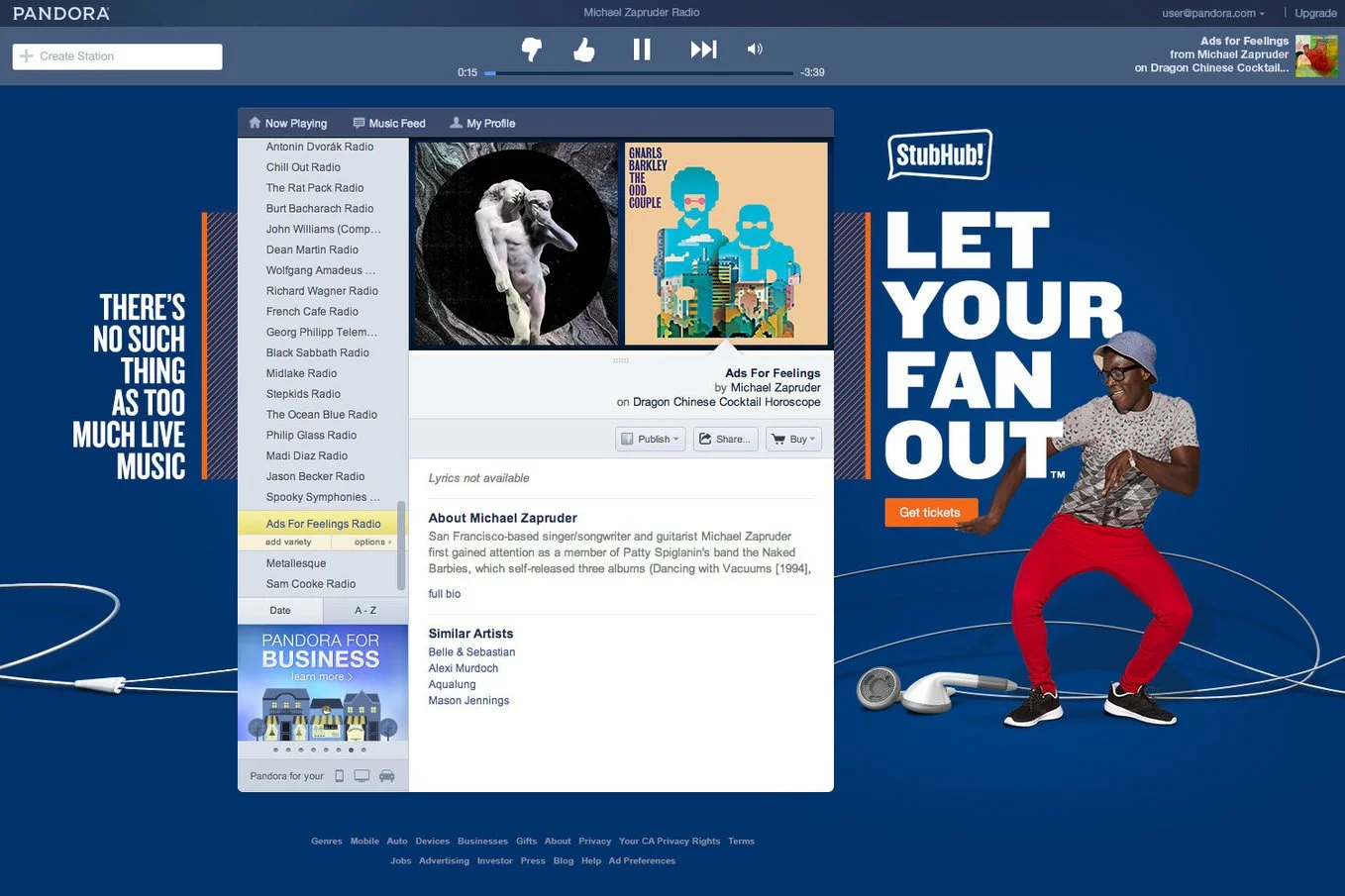
Our final output was a 60 page brand guidelines document, extensive asset libraries, templates, and a highly organized digital asset management system. The rebrand was deployed simultaneously across all marketing channels, web and native product apps, and our OOH footprint. The brand was launched in tandem with our new “Let Your Fan Out” marketing campaign including two 30 sec broadcast TV spots and affiliate and partner takeovers on properties including Pandora and ESPN.
RESULTS
Within six weeks of launch StubHub had it’s best sales month to date. Within six months time, NPS, awareness and purchase intent were at an all time high.
PR OPPORTUNITIES
Rebrand PR stories drove traffic, curated infographics, and organic social content.
BRAND CONTINUITY
Unified design language across marketing, responsive web and native applications.
VERTICAL DIFFERENTIATION
System flexibility allowed greater differentiation for theater, concert, and sports audiences.
Helped drive global expansion into Canada, UK, and Germany paving way for Ticketbis acquisition (40+ markets).
MARKET EXPANSION
COMPANY CULTURE
Influenced internal documentation, facilities refreshes, internal events, company swag, and more.


