INSIGHTS
Design Process
The following exercise will give you a detailed look into my design process from conceptual creation, through research, ideation and delivery.
The inspiration for this brand comes from a trip to the Catalonia region of Spain. While exploring Barcelona and the surrounding areas at the foot of the Pyrenees Mountains I became enamored with the rich history and culture of the area, particularly surrounding Tapas and the late-night dining culture.
Process
I planned out 4 distinct phases in my approach to this challenge. Phase 1 was to develop the high-level concept and story behind the brand that would guide the following steps. Phase 2 was researching Catalan history & culture, a brief competitive analysis, qualitative user research, and a mood board exercise. Phase 3 was developing and refining the typography, color pallet, and logo mark. Phase 4 was putting it all together and applying the identity system across branded physical collateral and the ordering app with a series of high-fidelity mock-ups.
Concept
The concept for the brand is a Catalan style Tapas food truck. Catalonia has a rich history and culture dating back to the 7th century. The brand draws inspiration from the late night dinner culture pervasive throughout Spain today.
Brand Attributes: Modern, Quirky, Playful, & Nostalgic.
Mission statement: La Empordà brings the rich culture and flavors of Catalonia’s cuisine to your backyard.
Research
I dove into the history of the Catalonia region going back to the 7th century focusing on prominent regions/landmarks, historical events and figures, traditional dishes, visual and performance arts. The output of this was used to inform the mind maps below.
Historical and Cultural Research
I scrupulously examined food focused blogs, brick and mortar and food truck reviews, and comments on relevant social media properties to gain a better understanding of the end user’s expectations and pain points.
Qualitative User Research
I researched Catalan/Spanish Tapas food trucks as well as brick and mortar restaurants throughout the greater bay area. The space was quite sparse when it came to Catalan Tapas with the notable exception of Barcino in San Francisco.
Competitive Analysis
Inspiration for the mood board comes from vintage Catalan posters, colors pulled from Catalonia’s architecture & traditional clothing, the traditional Catalan dance “Sardana,” as well as late night brick mortar Tapas spots in Barcelona.
Mood Board
Develop: Brand Name
I used a mind map exercise pulling from my research to map out 6 key areas (history, symbols of Catalonia, people/historical figures, regions, traditional dishes, and historical landmarks.
From there I pulled 5 examples of each category and highlighted contenders that were good candidates to move into typographic explorations.
Develop: Typography
I began by sourcing type faces that fit the brand attributes I had created. I had 8 potential candidates for the word mark and display font (Emrald, Florest, Geneva, Northwest, Levifan, The Farmer, Supreme, and Brewski) and began building rough type lockups / word marks. Brewski, Supreme, and The Farmer were chosen for the logotype contenders while Florest and Northwest were chosen for the display font.
I then moved on to body copy where I sourced 4 options from Google Fonts; considerations here were legibility and scale. I chose a series of sans serifs with unique character that would complement the distressed display font ‘Florest’ and work well with large scale signage down to small collateral and the mobile ordering app. I chose the ‘Poppins’ family (bold, semi-bold, and regular) after some experimentation and laid out a menu to explore the typographic hierarchy and scale.
Develop: Color
Inspiration for the color pallet came from colors of Catalan art, architecture, traditional clothing, and the rich warm hues of ingredients typically found in tapas dishes. I chose a series of cool grays and blacks to contrast the warm hues and pay homage to the late night dining culture pervasive throughout Spain and Catalonia in particular.
Develop: Logo Design
I began by taking the output of my brand name mind map and created a new mind map using the selected name as the input. Once again I broke this down into 6 key areas (Catalan landscape, the etymology of ‘Empordà’ which means ‘the market’, the Surrealist art movement in Spain, Empordà’s history, notable locations in Empordà, and Empordà DO a classification of the wine from this region) and 5 examples of each to draw inspiration from.
Because of the distressed / weathered type treatment of the logotype / lock up I decided against using golden ratio guides and opted for organic hand drawn shapes when developing the logo marks.
I created rough sketches of 3 concepts (Renaixença, La Sardana, and La Empordà) before making my decision on which to bring to fidelity. The ‘La Empordà’ concept was chosen as the contender that best fit the brand attributes I had laid out. Following the sketches I moved into Ai and refined the shapes. Next I added color and gradation, and finally I added a bit of texture/grain to give the logo mark more depth and continuity with the distressed type used in the type lock up.
‘Renaixença’ rough concept sketch. The phoenix was a symbol of the medieval romanticism that marked the artistic Renaixença period
La Empordà rough concept sketch. The Rooster, a symbol of pride & bravery in Spanish culture and a staple in many local dishes.
‘La Sardana’ rough concept sketch. Sardana is a traditional dance from the Empordà region of Catalonia which gained popularity in the late 19th century.
Building La Empordà final logo mark in Ai.
La Empordà final logomark
Deliver: Signage & Collateral
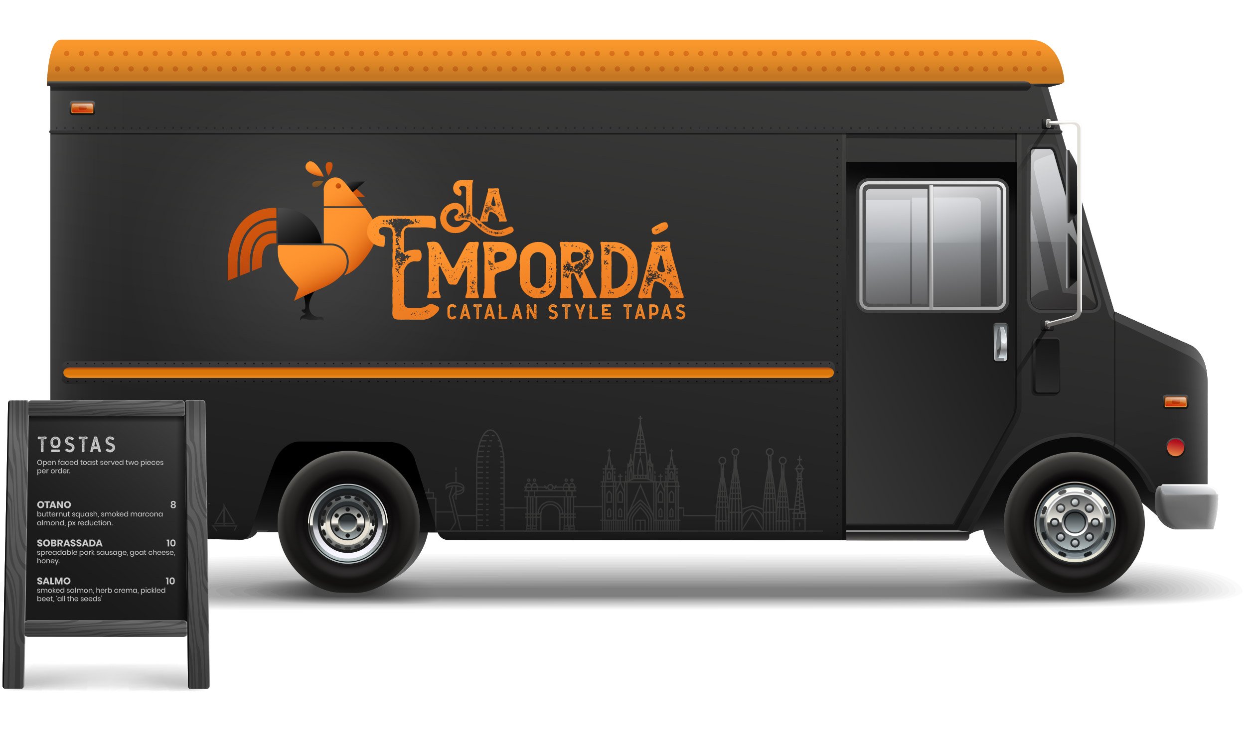
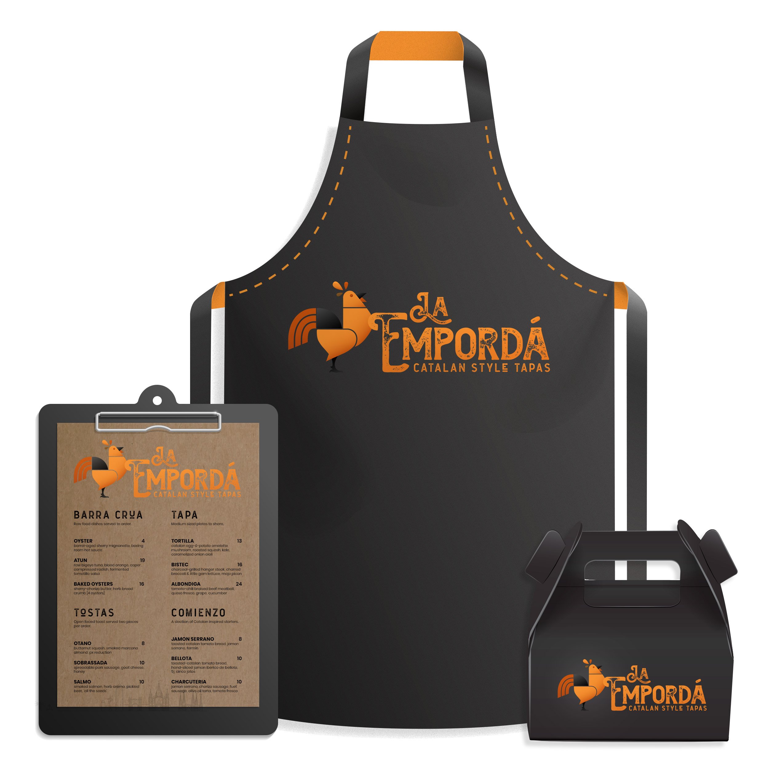
Bringing it all together I applied my color pallet, typography guidelines, and logo mark / type lock up across an array of physical brand collateral. I chose the dark grays and blacks within the pallet as the primary color of the collateral as a nod to the late night dinner culture of Spain and Catalonia in particular. This base gave the saturated colors of the logo lock up greater contrast and warmth.
Food truck and pop up black board menu
Food truck and pop up black board menu
Deliver: Signage & Collateral
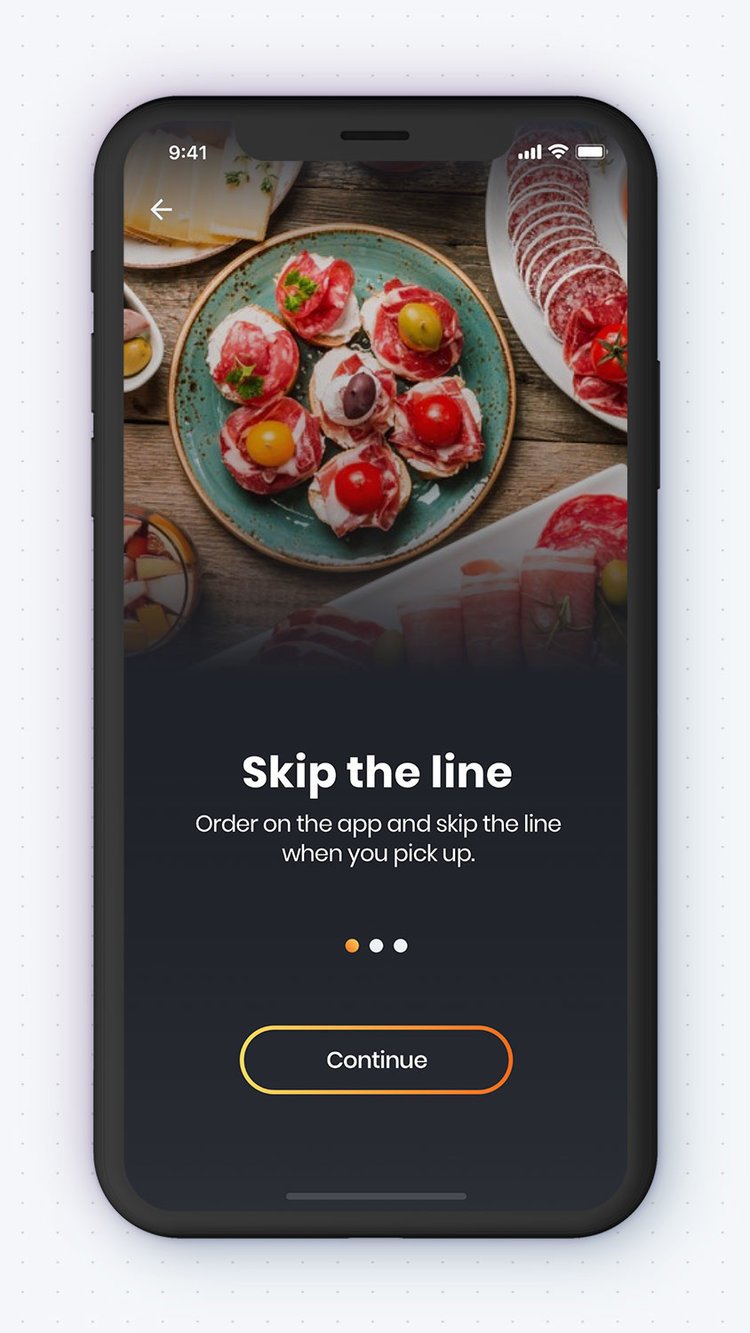
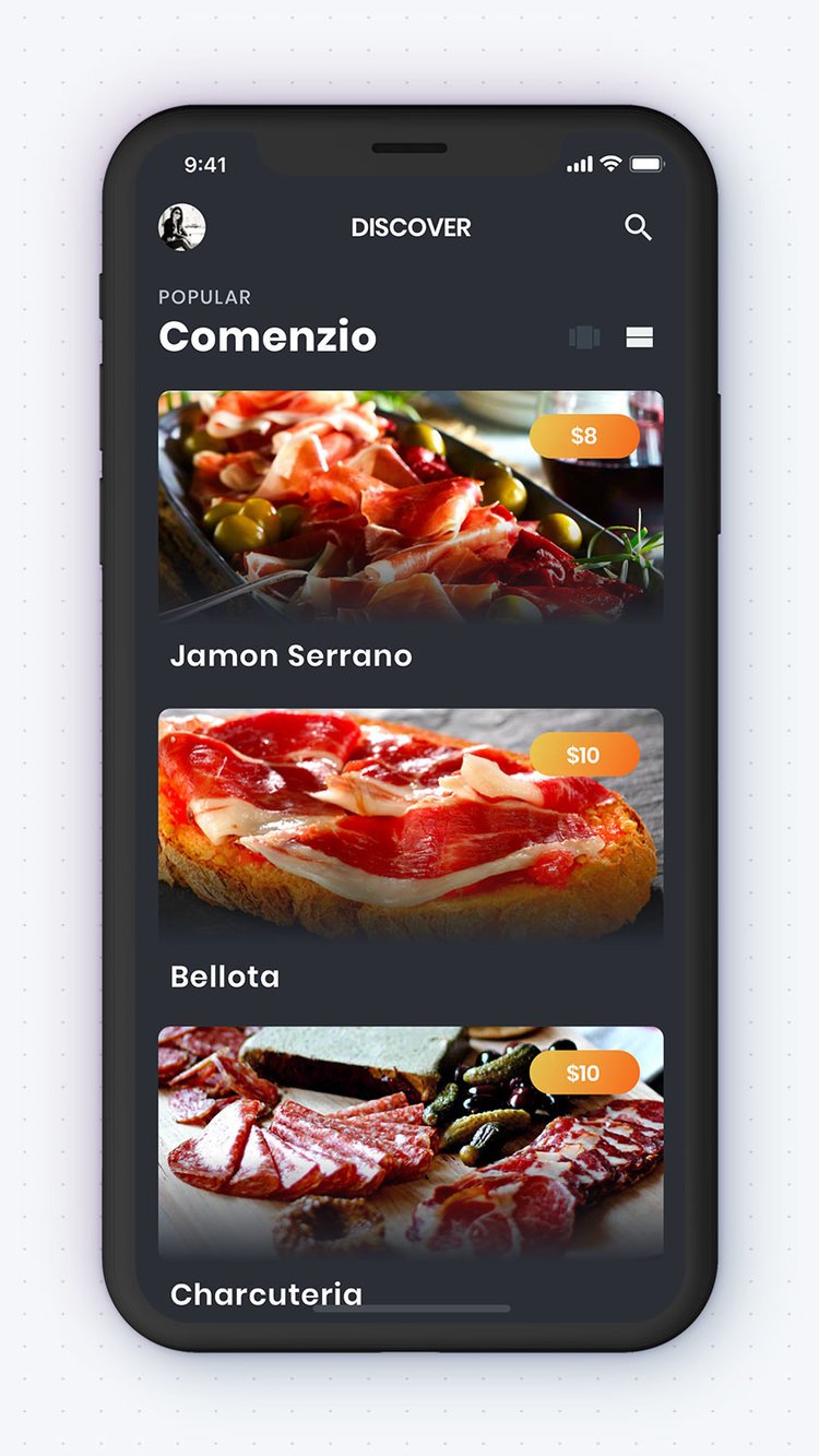
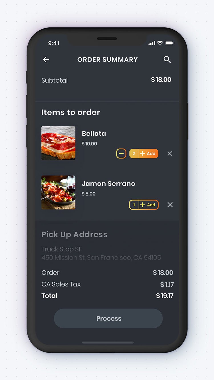
I chose four key screens for the high-fidelity mock-ups (a launch screen, an onboarding screen, a menu browsing screen, and an order completed/checkout screen) to showcase the brand across various instances throughout the user journey.
Launch Screen
Onboarding
Discover/Browse
Checkout/Order Summary
Further Considerations
Due to the nature of this exercise the case study represents a truncated approach to building out an identity system. It's worth noting in a real word project many externalities exist that would warrant deeper research, both qualitative & quantitative, as well as testing & validation using an agile methodology.
Additionally it is important to note, as a visual design exercise I have omitted voice and tone guidelines which are intrinsically connected to visual identity development. Both serve to convey the brand attributes to the user across all touch points though the customer/user journey.
Finally, In a real world scenario a more robust set of brand guidelines would be included in the final deliverables: Brand voice and tone guidelines (both internal and external) including copy samples, logo alternates (1 color, vertical & horizontal aspect ratio lock ups, app icon, fav icon, social graph icon) and their usage guidelines, brand design elements (graphic elements, illustrations, photography) and their usage guidelines, and finally a brand gallery of additional mock layouts.


