CASE STUDY
Pulse Trading Cards
Seeking a deeper understanding of their consumer base, Pulse aimed to uncover the mindset and motivations of collectors and determine how to position themselves effectively against both licensed and unlicensed competitors.
Tasked with rebranding the company from the ground up, we developed a cohesive brand identity and a user-centered e-commerce experience that established Pulse as a standout in the competitive trading card industry. My roles for the project included research, analysis, synthesis, identity/design system development, design application, and re-design of Pulse’s e-commerce experience.
Problem & Objectives
Pulse Trading Cards faced a significant branding challenge. The brand lacked a cohesive identity, with its website, social media, and packaging presenting a fragmented and inconsistent message. Key competitors like Topps and Panini dominated the market with established branding, leaving Pulse to carve out its unique space as a newcomer. Audience research revealed a strong desire for premium products, authentic experiences, and engaging storytelling, areas where Pulse’s existing materials fell short.
The goal was to create a unified brand identity and online presence that showcased Pulse’s commitment to premium materials and craftsmanship, established an emotional connection with collectors through storytelling and design, and provided a seamless e-commerce experience to drive engagement and sales.
Existing Pulse creative prior to rebrand
Process & Strategy
We began by analyzing Pulse’s competitive landscape and audience sentiment. A competitor analysis reviewed design and branding strategies of key players, highlighting opportunities for differentiation in transparency, innovation, and quality.
Audience insights identified Pulse’s core audience as passionate collectors seeking high-quality, authentic, and visually stunning cards. Consumer sentiment highlighted frustrations with stagnant designs, inconsistent quality, and poor customer service across competitors.
The transition from research to execution involved defining Pulse's core brand attributes—premium, authentic, innovative, and dynamic—based on audience and competitor insights. These attributes guided the creation of a cohesive visual identity, which was then translated into tangible deliverables like product photography, player imagery, and a redesigned Shopify storefront.
Pulse Trading Cards: “The heartbeat of the hobby”
Execution
I led a series of iterative design exercises and workshops with the Pulse team to bring the brand attributes to life.
The rebrand materialized through a cohesive and visually engaging approach. Bold and modern typography with high-contrast accents communicated Pulse’s authentic and premium character.
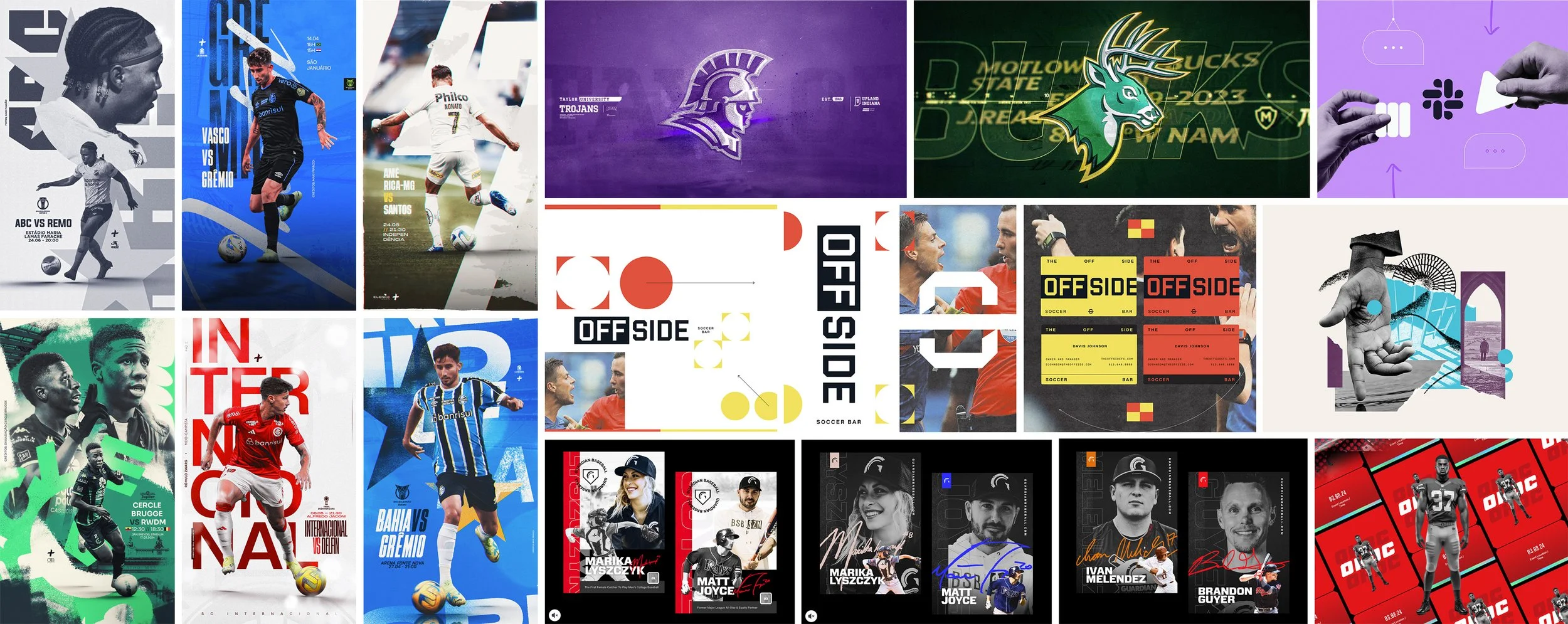
Dynamic compositions showcased thick cardstock, high-quality finishes, and on-card autographs. Player stories and product features balanced emotional connection with clear, concise information, fostering trust and excitement among collectors.
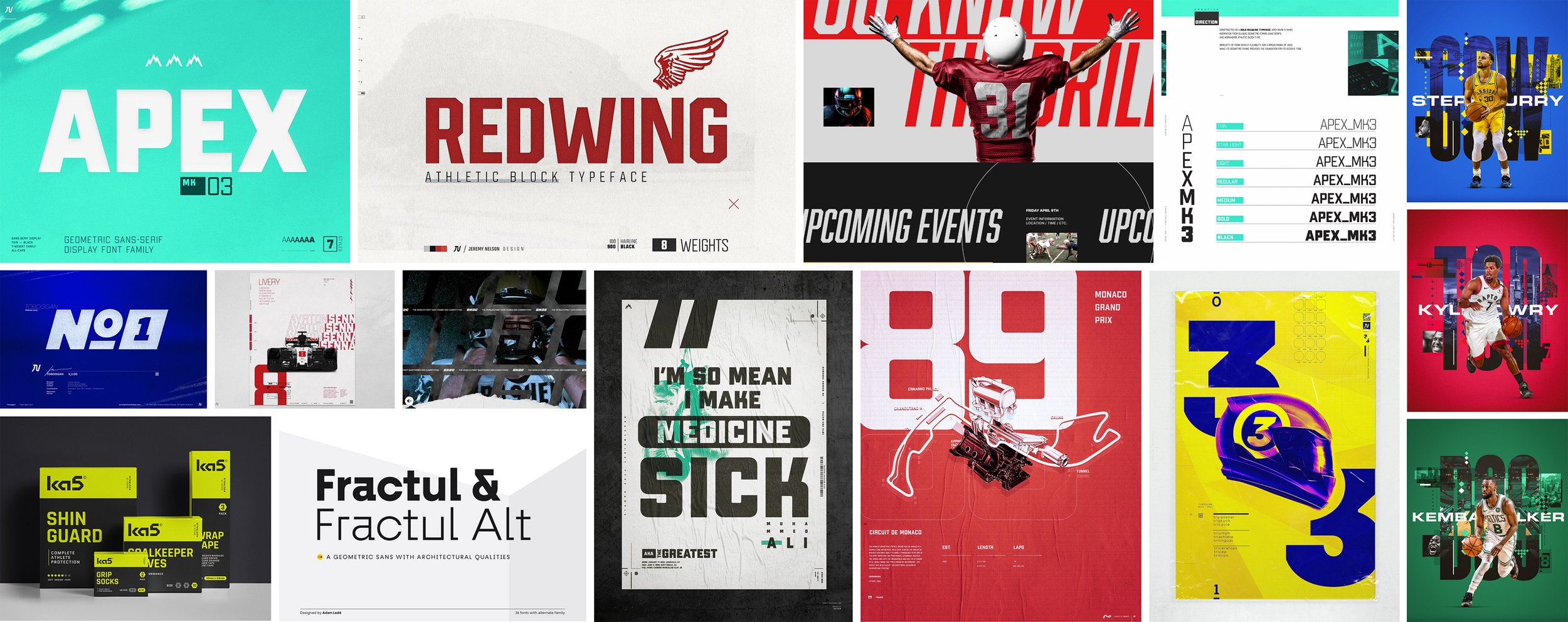
The design system emphasized four core attributes: premium, authentic, innovative, and dynamic. The visual identity combined bold Apex Mark 3 display typography with Mozaic Geo Variable body text, a rich color palette of deep blue and gold accents, tactile textures, and use of player autograph as design elements to emphasize a hands-on, premium feel.
Outcome
The rebranding of Pulse Trading Cards delivered a cohesive, premium identity that positioned the company as an innovative leader in the trading card market. Key deliverables included a comprehensive research and insights report, detailed brand guidelines documentation, and the complete rebranding and redesign of the Shopify storefront. The updated e-commerce platform featured a mobile-first design, structured product presentation, and dynamic storytelling through high-quality imagery and player-focused content. These efforts resulted in increased web traffic, higher sales, and improved customer perception, equipping Pulse with a strong foundation for sustained growth.
The Shopify website underwent a complete transformation. A mobile-first design optimized navigation, improved product clarity, and streamlined checkout processes. Product pages highlighted key features, such as premium cardstock and autographs, in a structured format featuring descriptions, product details, and key athletes. Hero imagery and dynamic player photos elevated the brand’s storytelling potential. Workshops and mood boards ensured alignment on typography, textures, and photography, bringing consistency and excitement across all touchpoints.
RESULTS
The rebranding of Pulse Trading Cards delivered a cohesive, energetic, authentic identity that positioned the company as an innovative leader in the trading card market.
PLAYER IMAGERY
Leveraging dynamic player imagery enhanced storytelling and brand authenticity.
AUTHENTICITY
Showcasing on-card autographs and premium materials reinforced trust and quality.
VALUE PROPOSITIONS
Clear messaging highlighted transparency, exclusivity, and collector benefits.
High-resolution product photography showcased premium design details.
PRODUCT IMAGERY
IMPROVED UX
A redesigned Shopify storefront streamlined navigation and purchasing.


